Get a FREE Map Pack!
Urban Action Map Pack
Aside from the FREE Map Pack, you also get:
- Monthly, FREE, exclusive maps
- Monthly micro-encounters
- Homebrew monsters
- Behind the scenes and sneak peaks
- Upcoming products
- Discount codes
Last month, in February, I talked about Reducing Production Costs And Increasing Profits With Cartography. However I didn’t go into details on cartography itself, so this is going to be the topic for March’s post.
First thing you need to decide is HOW you will execute the mapping. Are you an artist, good with hand-drawn stuff? This can work however I should warn you that if you intend to use cartography along with content creation like publishing on the DMsGuild, I believe it can get tricky as hand-drawn maps take a huge amount of time. If you want to focus solely on cartography, then it’s much more viable.
My recommendation is using a mapping software. There are plenty you can pick, some I don’t even know about. I have tried a few: Dungeon Painter Studio (DPS), Wonderdraft (WD), DungeonDraft (DD) and Inkarnate Pro. I also studied a bit about Campaign Cartographer 3 (CC3) to assess its business viability.
DPS is a bit limited and even though my first published adventure used dungeon maps made by it, I later replaced those maps by DD maps. WD is meant purely for regional maps. DD is a really cool and good tool for battlemaps. CC3 is a very complete, robust and complex tool, hence it has an extremely steep learning curve. In addition, try to find CC3 maps on Google and you’ll have difficulties to lay your eyes on many badass maps.
In my opinion, no tool beats Inkarnate. The reasons are many. With Inkarnate Pro, you can create ALL kinds of maps: world/regional, city, battlemaps, scene and landscapes. It’s very easy to use and learn, and provides thousands of assets out-of-the-box. It used to have a main downside which is getting less and less relevant: its recognizable style. However, Inkarnate now counts with 7 styles that can bring a lot of variety and life to your maps. The real major downside for many people is that it costs USD 25 a year on a subscription model, which can be expensive if you’re aiming for home use. For business use? It’s very little and you’ll get you USD 25 back very fast. My suggestion: subscribe to a month for USD 5 and access the tool.
PS: I don’t receive any money from Inkarnate to say those things. I say them because the software is great.
Now that you’re subscribed to Inkarnate, time to get to work. You could watch tutorials if that’s your thing, but I learned by making maps. You first need to decide the style:
Next come the Resolution. I’d go for 2k always, and then use the HD Export to get 4k or 8k maps when exporting the JPG. You also need to select the Aspect Ratio, which depends on the map you have in mind.
Once done, a blank map will load, fill with water. Please note that when selection the watercolor or battlemap styles, it may not look like water, but it is. You need to add land if your map had land. The left hand side menus are pretty self explanatory so I recommend starting to mess around with them. Add land, apply a texture with it and get a feel of the tool.
Create a few maps and try to get feedback on them to see what can be improved. Unless you have an artistic talent, your first maps won’t be masterpieces. And it’s alright. Practice will make each map better. Don’t worry, I have some tips for you to speed up this process.
Once you start having maps you’re proud of, share them away on social media. Here are some great places to do so:
Besides, I’d post the maps on a specific Pinterest board and share that one too. Feel free to use Instagram, Twitter, Discord or other places you are inserted in and may have a following.
The reason why this helps is that it will start spread your maps around and start having eyes on your maps. Maybe at some point someone will want to commission you like it happen with me.
Step 4: Put Maps in your Products
When publishing TTRPG products, use your new skills to support the products with your maps. This will bring added value to your product, helping with indirect sales. In addition, you can separate the maps and sell them separately. Don’t seek perfection. Aim for high-quality maps but without necessarily perfect maps, unless your product has only one map.
Step 5: Take Commissions
At some point, commissions make come into play. Take them! It’s good to mix flat-rates with royalties. I’d recommend putting more efforts on those maps than the ones you put in your products.
I’ll share some useful stuff I learned in the last 12 months which is when my cartography journey started. Hope that some or many help you 🙂
When painting natural ground (grass, earth, water, etc), blend different textures. Pick one to be your main texture, paint the whole area with it and then select a second one, reduce its opacity to maybe 50 to 60% and paint some bits of the land to make it look more natural.
Leave this tool be used specifically in world maps if you need to make commercial roads. If you’re on smaller maps, use textures to represent paths. First, paint a larger, lighter earth road, then reduce the size of the brush and paint a darker tone of earth. It’ll look much better!
Start your map with the bigger assets and features and once done, you’ll realize that the map will still look rather empty. Add details! For wilderness maps, add plants, flowers, rocks, big and small. In buildings, add small tables with flowers, rugs, wall decorations, etc. When adding wilderness details, make sure the Randomize Rotation cube icon is set (yellow).
Use the grid when creating battle maps and remember this: a square has usually 5 feet. If you place a bed that occupies 2 squares, that makes it a 10-foot long bed. Is your bed at home that big? If you place a kitchen chair that takes half a square… Is this the chair size you get at home? If your tavern walls occupy a third of a square, think: do the bar at your city has such thick walls? Compare your object sizes with real ones to get a feel of scaling.
Light makes a lot of difference. You can add light on its own but use the “light” assets. But you can also create additional impact by using the shadow texture at 50% opacity inside a building and then use lightning on torches and candles, or sunlight. To create wilderness night versions, you can paint the FG (foreground) and BG (background) with 50% opacity shadow and can select all objects and reduce their brightness to 50 or 60%. After that, add whatever light that makes sense.
Many objects have a “Customize Object Shadow” button (S) when you select them. You can tweak and change the direction of their shadow based on the light source you placed on the map. Very useful. Besides, you can create shadows will the shadow textures and highly improve the map quality with interesting shadow effects.
Each asset and texture has a “Filters” feature which allow you to tweak Hue, Saturation, Brightness and Contrast. You can use this to change a rug from red to blue, for instance. You can do so before placing the asset, or after you did. It’s very versatile. So in the light case above, you could add colored light.
You’re using a wooden floor texture and each square is filled with only 3 boards, meaning that this may be a bit oversized? All textures have some very useful features to help you with that. Under “Advanced Settings”, “Placement”, you’ll find Size, Rotation, Offset axis. Reduce the size to get a more close to reality wooden floor.
If an asset if almost perfect but has something additional that you don’t want, you can place the asset, flatten it to FG or BG and then paint it away. But from then onwards, you cannot select that asset anymore as it became part of the texture. This can be useful to remove the base of a statue, for example.
Unless your going for a big regional or world map, when going for a body of water with the Mask tool, use the circle brush option, but the edgy one. At close range, the edgy version will look very unnatural. Make your own coast manually with the circle brush.
Here’s a video with most of these tips:
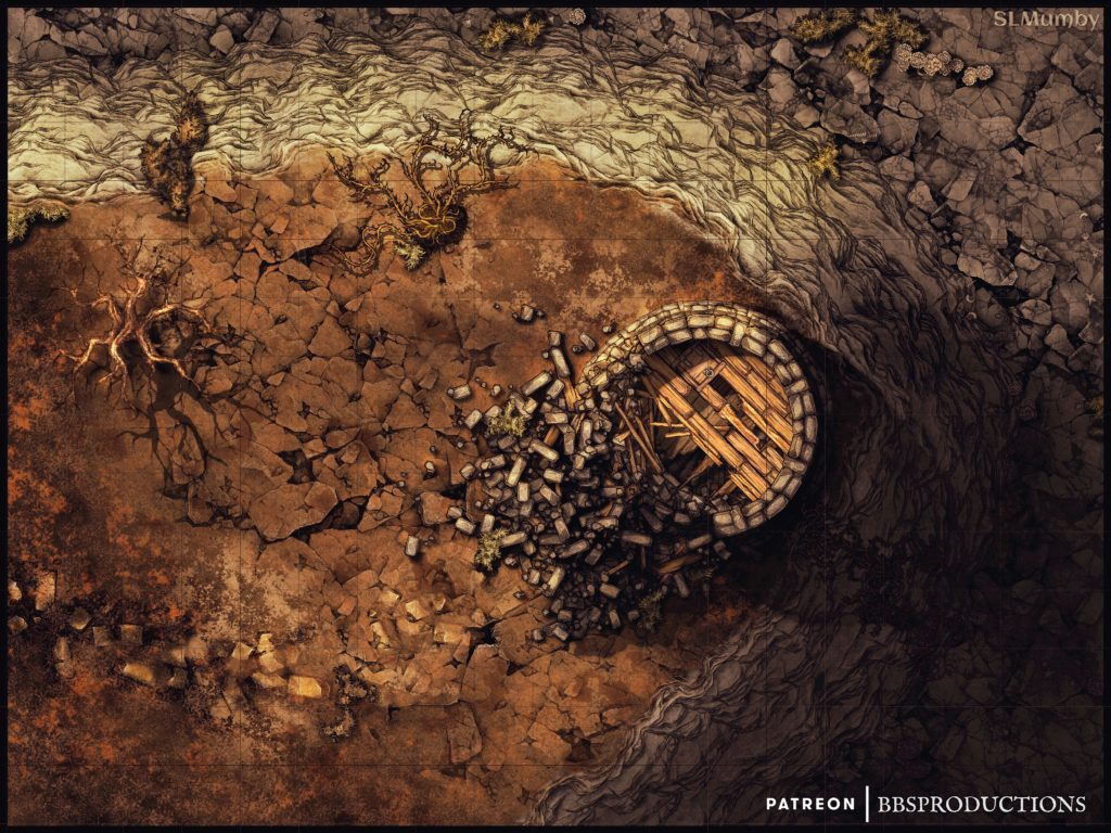
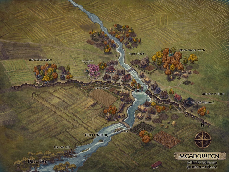
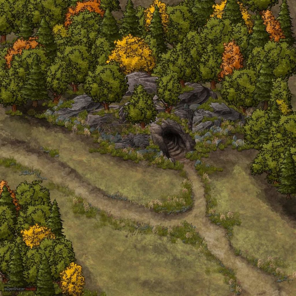
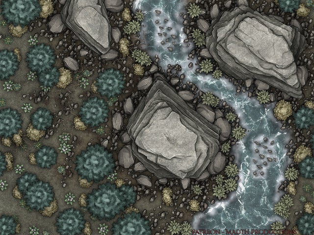
You can find some of my work in my Gallery. But check out these gorgeous maps made with Inkarnate Pro!

![]()